Time runs down the page, longitude across; each row is one month of the subsurface anomaly along the equator from the GODAS reanalysis, at about 95 m or as the depth of the 20 °C isotherm.
A Hovmöller diagram is a way of plotting data that changes over both time and space so that patterns of movement become easy to see. Instead of a map at one moment, it shows a slice of the world (for example, along the equator) with time running down the page. Each horizontal line represents conditions at a single time, and the vertical axis stacks these lines in order, so you can watch features like warm water anomalies drift sideways as months pass.
History
The diagram is named after Ernest Hovmöller, a Swedish meteorologist who introduced it in a 1949 paper to study atmospheric waves.
How it works
The horizontal axis is a spatial coordinate (like longitude), and the vertical axis is time, with the earliest time at the top. Each row is a snapshot of a variable—such as temperature anomaly or rainfall—along that spatial line. When a feature (like a warm pool) moves eastward, it appears as a diagonal stripe across the diagram; its slope tells you the speed and direction of movement.
A thrown stone follows a smooth arc: its path is easy to predict. But if the stone skips across water, the trajectory becomes jagged and far more interesting. Quantum particles behave much the same way when their state is not a calm wave with fixed energy but a turbulent mix of several waves at once.
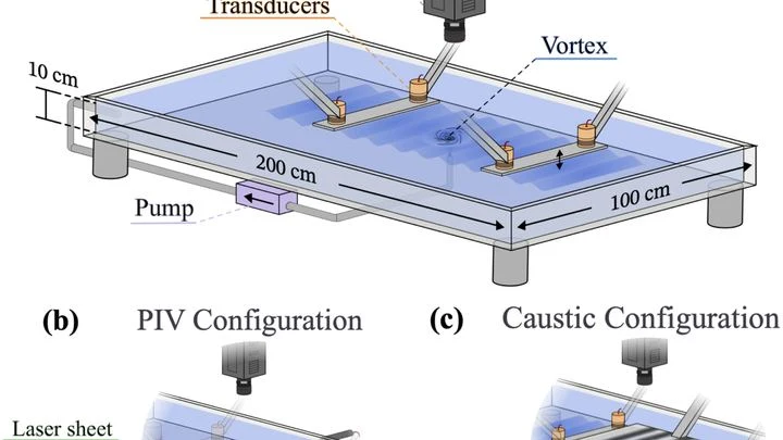
Water going down the drain swirls into a vortex. An everyday sight in the kitchen. But this very vortex turned out to be able to reproduce two effects that physicists usually associate with black holes and the rotation of planets.
The first effect is the shift of a wave as it goes around an obstacle.
Each heartbeat can be drawn as a point on a sheet of paper. Thousands of these points merge into a cloud. The Mapper algorithm turns this cloud into a network: it connects points that behave similarly and colors them according to blood flow strength. The result is not just a pile of numbers but a colored map showing which parts of the heart work in sync and which are out of step.
The heart beats, and on a paper ECG strip, each beat looks like a sharp spike with two humps: a quick rise, then a smaller wave, then a descent. A doctor looks at such a strip and sees the rhythm, but the shape of each spike, how exactly the muscle contracted, is hard to discern, especially if the recording lasts a full day.
This new method turns that strip into a colorful carpet.
In disordered materials, such as organic semiconductors or inks made from two-dimensional materials, electrons don't move smoothly like water through a pipe. Instead, they hop from one spot to another, like a ball bouncing across a rough surface. This kind of motion is called hopping transport.
A fractal that looks like a butterfly hides an order that is not visible at first glance. In the quantum world of one-dimensional quasicrystals described by the Komoto model, the energy spectrum forms a whimsical shape: the Komoto butterfly.
A meteorologist looks at a map where clouds gather in flocks, like birds before a storm. Each spot on the radar could be a future downpour or just noise. Earth system forecasting is like trying to assemble a puzzle with thousands of pieces that keep changing shape.
The river that circles Antarctica does not flow in a single channel: it sometimes splits into branches, sometimes merges into one stream. That is what the fronts of the Southern Ocean look like on maps built from satellite data on sea surface height. Previously, these fronts were sought along lines of equal water level, and they seemed to creep slowly southward.