A heat map is a data visualization technique where individual values in a matrix are represented as colors, with a gradient typically ranging from cool (low values) to warm (high values). In physics, heat maps are often used to display binding strengths, energy distributions, or correlation patterns across a parameter space, making complex numerical data intuitively accessible.
History
Heat maps have roots in 19th-century statistical graphics, but their modern use in scientific visualization grew with computer graphics in the late 20th century.
How it works
Heat maps assign a color scale to numerical values, often using a colormap like 'viridis' or 'jet'. Each cell in a grid is colored according to its value, allowing patterns such as clusters, gradients, or anomalies to be spotted visually. In binding strength studies, for example, a heat map might show interaction energies between atoms or molecules across different configurations.
In practice
Heat maps are widely used in condensed matter physics to visualize band structures, in bioinformatics for gene expression data, and in machine learning to display model performance across hyperparameters.
Fun fact
The term 'heat map' was popularized in the 1990s by software designer Cormac Kinney, who used it to describe a 2D display of financial market data.
Imagine a book with latches on its pages: you can only flip a page if you know how to click its edge. That is roughly how the mechanical metamaterial we are about to discuss works. Each cell is a small mass inside a larger one, connected by an elastic beam. The beam can sit in two stable positions, like a switch.
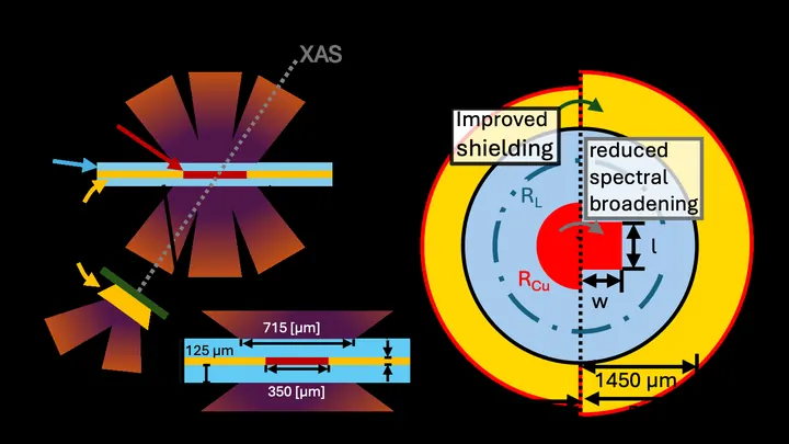
A laser beam strikes a thin target hidden inside layers of another material. Within billionths of a second, the material is compressed to a density of 25 grams per cubic centimeter, as if a piece of lead became more than twice as heavy without moving an inch.
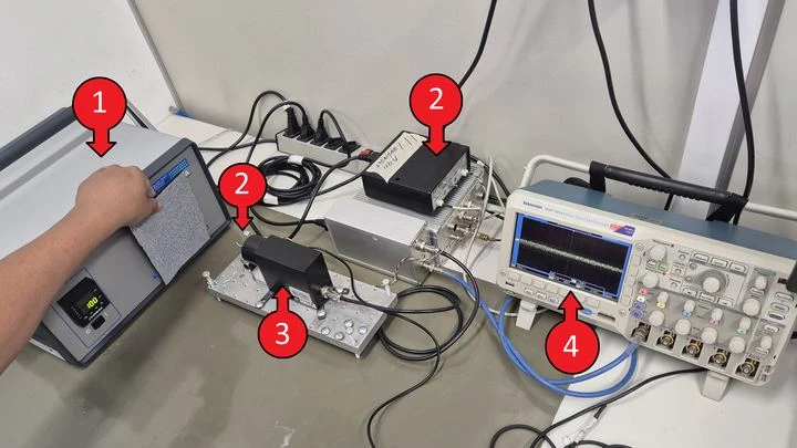
In the kitchen, when a pan heats up, your hand feels the heat before you even touch it. A solar telescope picks up similar invisible heat — only from a star, not a stove. The instrument, called HATS, captures radiation in the terahertz range, which was previously little studied due to technical difficulties.
Two dice always land on the same number, no matter how far apart you toss them. In quantum physics, this behavior is called entanglement, and it's the key resource for future computers and secure communication. The trouble is, not all entanglement is easy to spot.
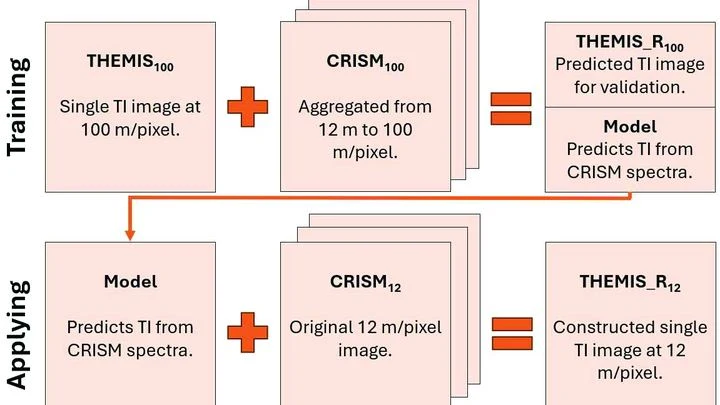
Warm rock and cold sand cool at different rates at night. An instrument orbiting Mars measures this heat, revealing whether the surface is loose dust, a dense crust, or solid rock. But thermal images have a resolution of 100 meters per point: an entire football stadium fits into a single pixel. Fine details (the beds of ancient streams, the edges of lava flows) are simply invisible.
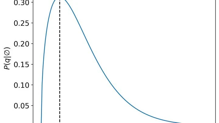
Hot tea cools down, and its temperature is the same throughout the cup. But in many systems (for example, in the rarefied gas between stars or in plasma) temperature is not uniform: in one place particles are faster, in another slower. Physicists call such systems "superstatistical": it's as if the tea consisted of many small regions, each with its own temperature.
Picture a packed bus where every passenger is an electron. In a superconductor, passengers pair up and move in sync, losing no energy. But in high-temperature superconductors like cuprates, this idyll only works when extra passengers are added. If you drop some off, the pairs start acting strangely.
Strike a tuning fork, and it rings with a single pure note. But if the fork is trembling and people are chattering nearby, the sound won't be perfect. Same with molecules: each one absorbs light of a specific color, but due to its own vibrations and the jostling of neighbors, that color gets smeared out.
The authors of the paper figured out how to show this to students without complex formulas.
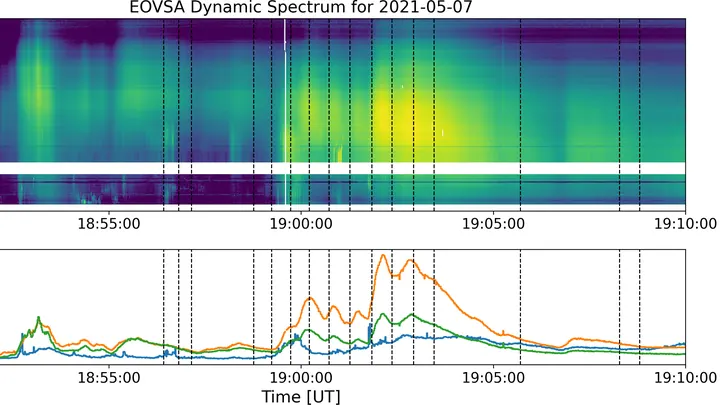
A solar flare is like a giant spring that gets twisted and twisted, and then suddenly snaps. The energy stored in the magnetic field is unleashed into space within minutes, heating plasma to millions of degrees.
Hydrogen is the lightest fuel, and its conversion into electricity on a metal surface resembles a game of ping-pong: hydrogen atoms alternately attach to and detach from the electrode. But the score in this game depends on solution acidity in ways that were unexpected. Classical formulas predict a smooth change, while experiments show jumps and kinks.
A thermometer dipped into a sample usually tells you only the temperature. But if the temperature oscillates slightly and the sample responds with a delay, that response hides more: the imaginary part of the heat capacity, which turns out to be able to hear the quantum echo of time.